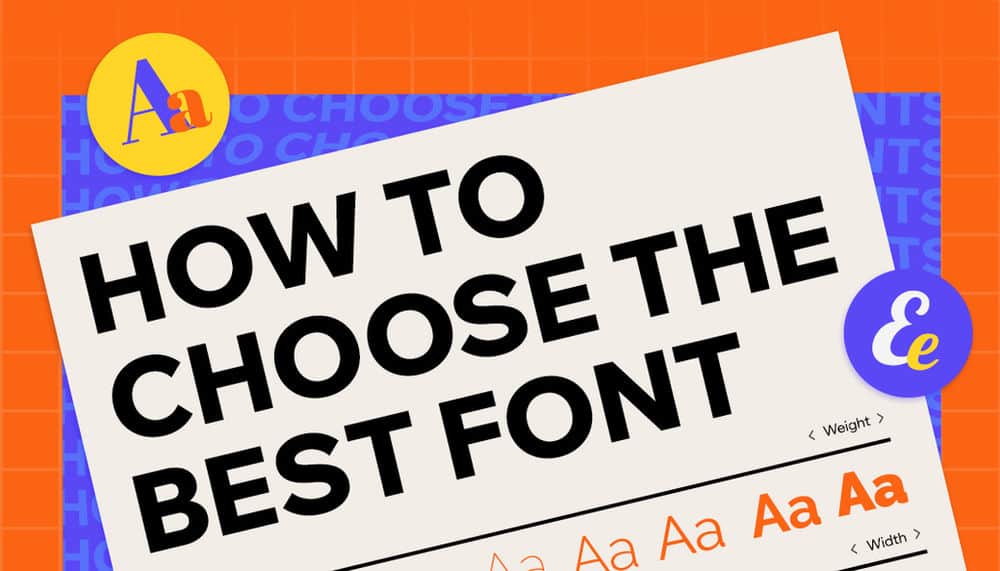
The Complete Guide to the Best Creative Fonts for Websites and How to Choose the Right One, Step by Step — Part 1
23 December، 2021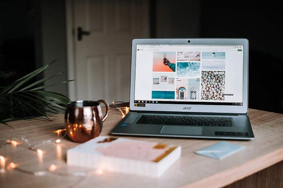
5 Tips for Choosing the Right Images for Your Website 📷
26 December، 2021
[lwptoc skipHeadingLevel=”h3,h1″]
Best Website Fonts | We mentioned in الجزء الاول Website design has several stages. One of the last—but still important—stages is
هي اختيار أفضل fonts. Today, we’re continuing with Part Two of our guide to the best website fonts.
Wavy / Wavy-Style Fonts
In many cases, wavy fonts have a romantic or artistic feel. That’s why you can often find this
type of font that imitates handwriting. They’re usually used sparingly in headings, titles, and logos.
Longer passages may be difficult to read and look cluttered when set in these fonts.
Bahamas Brush
Style: brushstroke effect, handwritten look, elegant
Applications: blogs, logos, restaurant menus, and in photos, illustrations, or overlays
Suggested industries and projects: travel, tourism, food, and photography
Tip: The Bahamas Brush font used in headings adds a distinctive style to text.
Bahamas Brush is ideal for travel websites or travel-related blogs. The font can be used in logos and various types of
graphics. It beautifully complements photos of nature or urban architecture.
Romantic and Wedding Fonts
Romantic fonts often combine formality, freedom, and a sense of appetite in a unique way. They are often written
Handwritten and richly ornamented. Wedding invitation fonts can be used throughout an entire design, though they’re best suited to limited, prominent text.
If you’re designing a website for the cosmetics, fashion, or jewelry industry, you can also
use this collection of fonts
Gattely Lovely
Style: Handwritten, decorative, elegant, romantic
Uses: Invitations, headings, social media
Recommended industries and projects: Weddings, art, photography
As its name suggests, Gattely Lovely is perfect for events, especially romantic family occasions
(for example, a wedding). This font is essentially an embellishment that adds beauty to all kinds of invitations and posters.
You may also be interested in:Top 10 Web Development Trends in 2022
Professional and Elegant Fonts
Professional and business fonts have a lot in common with global or minimalist fonts. However, in the elegance category,
you can find more elaborate fonts with decorative elements that look great on jewelry or fashion websites.
خطوط أنيقة
Fine-looking fonts are currently among the best fonts for websites. Delicate
and simple fonts will make your website look beautiful and professional while remaining highly readable.
Elephant
Style: Outlined, precise, and elegant
Applications: Watermarks, quotes, headlines, and background image overlays
Recommended industries and projects: Creative work, graphic design, photography, art, and fashion
Elephant is a bold yet elegant outlined font. It’s designed to work perfectly for photography and graphics
or any other creative industry. It features clean, expressive lines and a slightly geometric shape

خطوط الأعمال
Some of the best fonts for websites are business fonts. Consider whether the font is readable, light, and transparent. It should convey
These fonts are characterized by precision and professionalism.
Cooper Hewitt
Style: Geometric, modern, professional
Tip: Ideal for blog posts
This elegant font comes in seven different weights. Cooper Hewitt is a modern typeface made up of curves and arches.
Geometric. This thin, lightweight font will give your website content a professional tone.
You may also be interested in:Our approach to creating a one-of-a-kind website design
Resume fonts
Designing your résumé: choose your font with great care. What should you consider? Think about the role and industry you want to join, and how you want recruiters to perceive you.
Before choosing, make sure to check how your chosen font looks in both digital and print formats.
الخط الذي اخترته في الشكل الإلكتروني والمطبوع.
Although résumé styles have changed considerably in recent years, the most popular fonts remain universal ones.
It’s also worth remembering classic options such as Georgia or Helvetica. Business fonts can also be used when creating a résumé. However, be careful with decorative fonts—ideally,
استخدام خطوط الأعمال في إنشاء السيرة الذاتية. ومع ذلك ، كن حذرًا مع الخطوط الفنية – من الناحية المثالية ،
You should limit its use only if you’re a leader in the creative industry.
Georgia
Style: Readable, professional, classic
This font’s serif style doesn’t compromise its readability. It gives any design a professional, elegant look. You’ll also find Georgia
It’s a good fit for other essential job application documents, such as portfolios and cover letters.
الخطوط الفاخرة
Adriane Lux
Style: Elegant, simple, readable, classic
Use: Invitations, headings, and titles
Suggested industries and projects: weddings, jewelry
A beautiful and elegant font. Despite its three-dimensional style, it retains a refined, luxurious look. It will look great in
elegant designs.

خطوط عتيقة
Vintage styles are still popular, so vintage fonts are commonly used. They’re often chosen for their
unique, nostalgic character. First and foremost, they’re well suited to culture-related projects, such as those
in publishing or film. These fonts are often inspired by vintage lettering or places
or historical events, which only enhances its uniqueness.
You may also be interested in:What’s most important when creating a high-quality website?
Typewriter fonts
This type of font comes in many variations. Some are updated to offer a classic look
with a modern touch while remaining easy to read. Others look closer to the originals. They give text elegance
and a distinctive character that evokes nostalgia.
Roboto Mono
Style: elegant, simple, and readable
Applications: books, newspapers, blogs, and longer-form content
Suggested industries and projects: publishing houses and creators of all kinds of online content
Roboto Mono is a modern typeface inspired by the typewriter. However, the influence isn’t too obvious, so you can use it
This font isn’t just for vintage designs. Roboto Mono is not only readable, but also adapts to any kind of
reading. It looks good on paper as well as on computer screens.
Rural lines
These are the typefaces I’d most recommend for casual industries. They’re usually suitable for more text-heavy
Secondary use (logos, headings, etc.). Used in reasonable amounts, it is highly legible and has a distinctive character.
Bernier
Style: decorative, old-school, vintage
Applications: logos, signs, menus, service or product presentations, graphics
Suggested industries and projects: restaurants, hair salons, fashion, and businesses with a vintage aesthetic
This font is suitable for a variety of vintage-inspired industries. Bernier, used in a restaurant logo or menu,
or on a sign—for example, at a barbershop—will give your brand a distinctive retro atmosphere. The font comes in three versions: Regular,
And difficult to read, and shaded.
You may also be interested in:How to Optimize Your Website for Better Results
الخطوط القديمة
Vintage fonts are often used for their unusual character and distinctive decorative style. Are you creating a website
or a project that references a bygone era? Retro fonts are essential. You can use them, for example, in
materials related to cultural events.
خطوط السبعينات
هذه الأنواع من الخطوط مستوحاة من مناخات الديسكو. تتميز الخطوط ’70 بالانسيابية ومتعة الشكل. في كثير من
These typefaces have rounded or other unusual curves. Because of their unconventional, artistic nature, they’re best used
as decorative elements that add character to the content.
Cool beans
Style: cinematic, classic, retro, fun
Use: headlines, on-page text, occasional graphics
Suggested industries and projects: creative, advertising, marketing, fashion, photography, film
Kool Beans is a highly unconventional and fun typeface. It will brighten up and add color to any content. It works best as a supplementary font.
It can be used for headings and shorter content.
خط الثمانينات
Eighties fonts are also among the best fonts for websites. They’re decorative and original, with an 8-bit design
neon colors, and uneven finishes. The film gaming, and music industries use them enthusiastically as a form of expression
عن مشاريعهم.
Big Shoulders Inline Text

Style: retro, decorative, historical, characterful
Use: on flyer posters
Industries and suggested projects: film, art, theater, and music
Large shoulders were designed for shorter, more expressive content, without unnecessary embellishments. They draw attention to the content presented
and give it a retro feel. They also have a nightlife-inspired character that’s perfect for different types of clubs.
You may also be interested in:How to Grow Your Business Online in 4 Simple Steps
خط التسعينات
In 1990s typography, the influence of digitization was clearly visible. During this period, many fonts were created
inspired by computers. They are primarily light in color and move away from simple shapes.
Binary Soft
Style: Retro, elegant, casual
Applications: Advertising, posters,
Suggested industries and projects: Marketing, advertising
With its rounded edges, Binario Soft softens any content and presents it elegantly without feeling overly formal.
The typeface is inspired by Italian Art Deco, as well as advertisements and store signs from the early 1990s.
الخطوط الحديثة
The vast majority of modern typefaces are simple, with subtle details that give them character. But this isn’t
Everything, because this category includes many fonts that capture the essence of big cities. If you’re creating projects
that are modern, urban, or artistic, you’ll find a font that’s right for you.
Urban fonts that evoke the atmosphere of major cities are usually very free-spirited. Sometimes, handwritten lettering
reflects the character of sprawling cities with millions of residents. Urban fonts can also be
more minimalist, featuring only small decorative elements.
Top brush light
Style: brush lettering effect, street style
Applications: body text, headings, and text and graphics in social media ads
Recommended industries and projects: fashion, arts, creative work, and anything related to industrial style
Top Light Brush is an example of an urban, handwritten-style font. It’s a great fit for any website or project.
With its street-inspired look, this slightly edgy font works well on websites targeting young people.
You may also be interested in:3 key features missing from website design… find out what they are
خطوط النيون
Neon fonts evoke the look of neon lights and similar types of lighting. They grab attention and are highly eye-catching.
They aren’t the most practical typeface. They usually work well as accents to highlight selected parts of the text.
Monoton
Style: letterpress, graphic
Applications: stickers, clothing, publications, logos
Suggested industries and projects: film, publishing, photography, and special event planning
Monoto is an example of a letterpress typeface. It’s bold and weighty. Its striking appearance immediately draws attention to
the content it presents. It works very well on posters and in various types of catalogs and publications.
Bold lines
Heavy fonts are also among the best-known and most popular website fonts, drawing attention to the content
in a clear way. Thanks to their weight, they work well for all kinds of headings and titles, as well as quotations.
Peace Sans
Style: modern, distinctive, and transparent
Uses: logos, website text (body text, headings, and titles), and text on graphics and images
and publications and catalogs
Suggested industries and projects: tourism, events, marketing, technology
Tip: The Peace Sans font will blend perfectly with nature photography thanks to its simple, calm style!
It’s a smooth, clear font. Peace Sans has a striking design that ensures no user will pass by
your website without noticing it.
الخطوط سميكة
These types of fonts don’t work well for long-form text, but they’re ideal for short messages. Use them if you want
to add a touch of humor to your website’s personality.
Asset
Style: Bold and elegant
Use: Articles, headlines, and quotes
Suggested industries and projects: Publishing, art, and interior design
The original design was inspired by the lettering found on U.S. banknotes.
Although the typeface itself is massive, its wavy shape makes it appear lighter than it actually is. However,
this impression should not be relied on, as it was designed for short-form text.
Follow the third and final part.