How to Write Product Descriptions That Drive Sales
12 October، 2022
How to Choose the Best Domain Name for Your Online Business
23 October، 2022
The Top 11 Elements of Modern Web Design
تصميم موقع الويب | يتغير تصميم المواقع بشكل مستمر. في حين أن هناك بعض الثوابت – مثل الحاجة إلى
محتوى ملائم وجذاب – إلا أنه تظهر باستمرار عناصر إضافية يمكن أن تعزز تأثير موقع الويب.
Some of these elements help tell your story and explain what your company is all about, while others capture
users’ attention right away or improve the experience on any device. You don’t need to use every element at once (doing so
can create a cluttered, confusing experience). Instead, choose specific elements that align with your brand and website goals.
Yours can help amplify the overall impact.
To help narrow your focus and find the best elements for your website, we break down
the most important modern web design elements you can implement to improve your website’s performance.
.
Distinctive Typography
Most companies have a particular font or typography style they use to help customers recognize them instantly
compared with their competitors. In recent years, designers have gained access to a wider range of fonts, making it easier
Companies can express their brands more precisely through typography.
.
Why Is Distinctive Typography Useful in Modern Web Design?
Typography is a distinctive design element that creates a consistent look across every page of a website.
عند إنشاء Brand For your company, your choice of typography can offer subtle clues about what you stand for. Is your business
fun or serious? Functional or informative? Whatever font you choose, make sure your designer considers its compatibility
across browsers and computers. Choosing a font that isn’t supported by popular browsers and computers may mean your website
displays awkwardly on different devices.
.
Engaging, Responsive Images
You don’t have to look beyond the popular publishing site Medium to see an example of a great hero image.
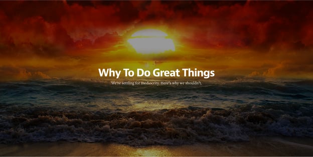
Modern Website Design Elements: Hero Images. Images like these move away from the traditional above-the-fold and below-the-fold concept,
and instead offer a more individual perspective. By focusing on the image with just text,
rather than a CTA or social buttons, Medium creates a powerful visual experience that encourages you to scroll down and read more.
A hero image is often placed in the background, with text and other content layered on top. Regardless of the style you
use, large images can help tell your story visually without having to rely on text alone.
.
لماذا هو مفيد؟
تحدد الصورة نغمة موقع الويب الخاص بك دون الحاجة إلى نص أو فيديو – يمكن للصورة الصحيحة
immediately give visitors a sense of what your brand is about, what you do, or what makes you unique. As a result,
it’s a good idea to brainstorm image ideas and get feedback from different sources to determine which image will make
the greatest impact.
.
Background videos
Autoplaying background videos can add a lot of intrigue to a page.
They can be used to tell a story and significantly reduce the amount of other content needed to explain your business.
خذ موقع Wistia For example, when you land on their homepage, a large video starts playing automatically
in the background. Click the play button to take a closer look at the company:
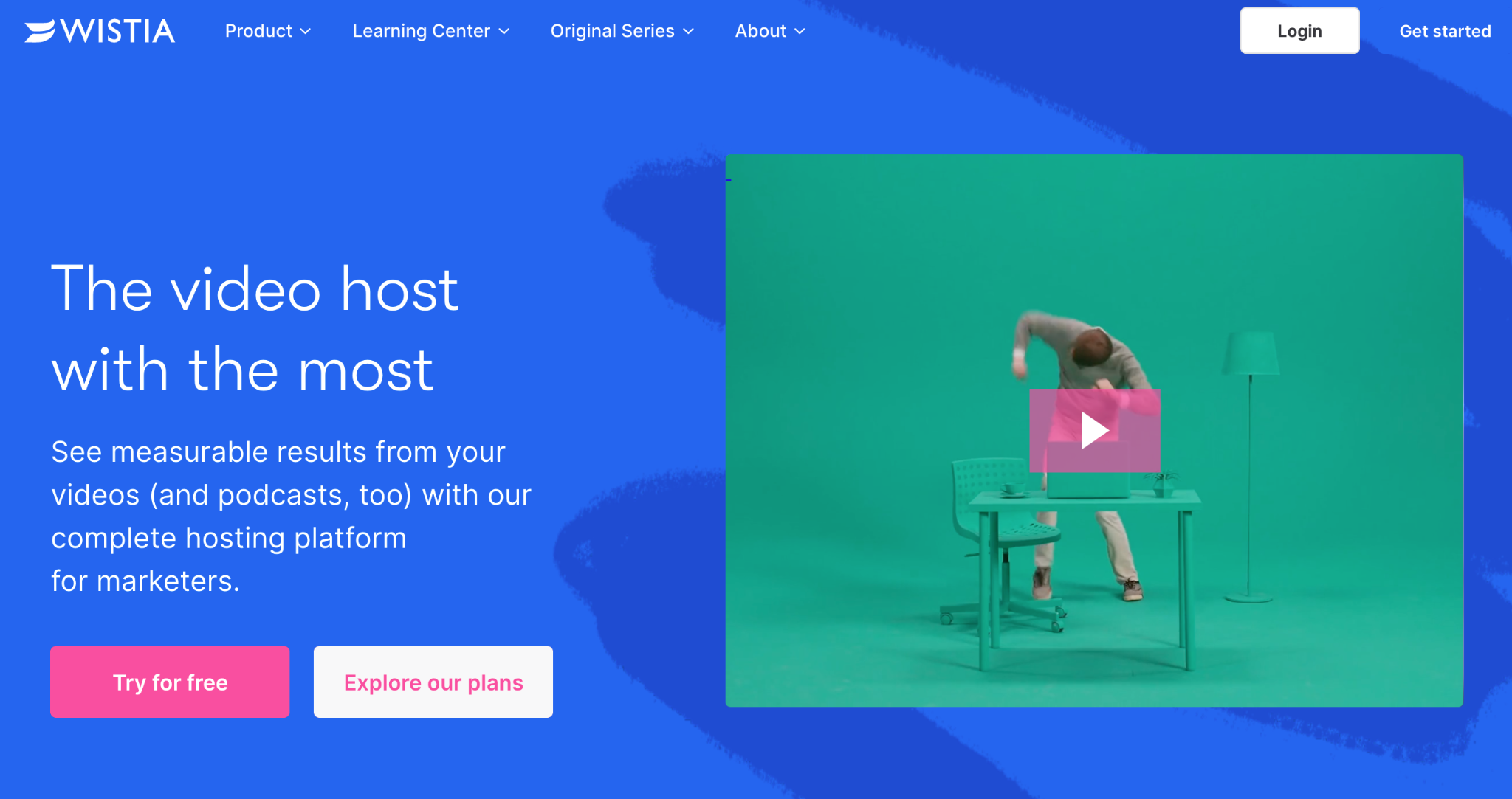
This background video is a great way to encourage visitors to click and stay on the page longer.
.
لماذا هو مفيد؟
Background videos are designed to captivate visitors from the moment they land on your page. Video helps visitors understand the key points
about your company without having to read a single line of text.
In addition, our brains process video 60,000 times faster than text. While people hesitate
When reading large blocks of text, videos often stand out and can be consumed very quickly.
It also helps improve connection speeds and increase the capabilities of mobile devices, making for a better video experience.
.
تصميم شبه مسطح
Simply put, flat design is any element that doesn’t include or suggest three-dimensional effects, such as shadows. It doesn’t just make
flat design easier for users to understand; it can also load faster on websites without elements that are
overly complex or technical.
تحولت العديد من المؤسسات – الكبيرة والصغيرة – من التشكل الواقعي إلى التصميم المسطح. ومع ذلك فقد وضعت
Companies like Uber have made their own mark on the style by adding subtle shadows and depth.
.
لماذا هو مفيد؟
Flat design helps visitors understand your content more quickly, while adding a few depth elements
can bring it to life. Whether you design your entire website using flat design
or use shadows and other elements, it’s important to stay consistent throughout your website. Make sure your
homepage, product pages, and any other major sections of your website all use the same design cues
so visitors can immediately understand what they’re looking at.
.
قوائم همبرغر
Most websites have long lists of options to choose from. The benefit is that the menu can take visitors
directly to where they want to go. The downside is that it generally takes up a lot of screen space. The hidden menu
or hamburger menu changes that. This compact menu saves space and gives users an intuitive way to navigate. Website design elements
الحديثة: Hamburger Menus
Wondering why it’s called a hamburger menu?
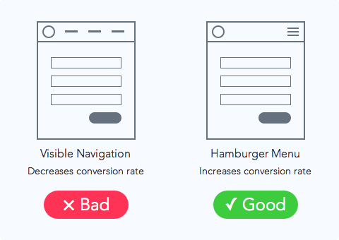
إذا كنت تستخدم خيالك فإن الخطوط الثلاثة المكدسة فوق بعضها البعض تبدو مثل اثنين من كعك البرجر وفطيرة.
.
لماذا هو مفيد؟
Your website pages should give users a clear path to follow. Removing cluttered navigation makes
the experience cleaner and free of distractions. This increases the likelihood that users will find the information they need to complete
the desired action.
.
High-quality product images
Many websites have started B2B displaying large product images on their sites to highlight different features or parts
of their products—and this wasn’t by accident.
To give you a better idea of what we mean, let’s take a look at HubSpot’s Marketing Hub product page:
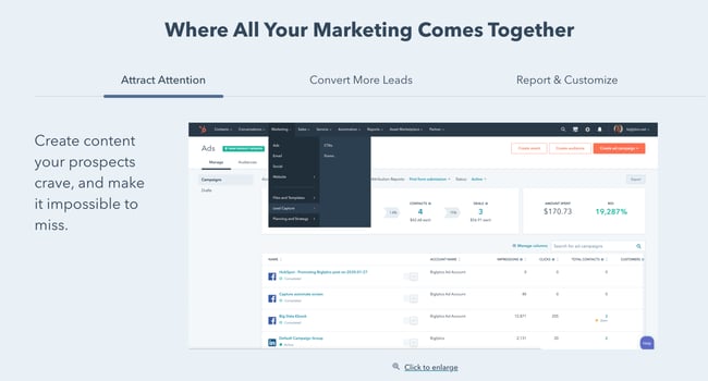
There’s a large hero image on this page, and as you scroll down, you’ll find additional, more detailed product images. The images are also
responsive and designed to ensure an enhanced experience for visitors using different devices, as mentioned earlier.
.
لماذا هو مفيد؟
High-quality product images help designers showcase the product’s different features more efficiently and effectively.
This approach amplifies the benefits of a feature by making it possible to highlight its most valuable aspects.
These large images are easy to scan, too. They help visitors build a strong understanding of what the product’s different features do.
By conveying them through images rather than words.
.
تصميم البطاقة
With the rise of Pinterest, designers and marketers alike became fascinated by cards. Individual cards help
present information visually, so visitors can easily consume small pieces of content without feeling overwhelmed.
Miiryia’s homepage is a great example of card-based design in action:
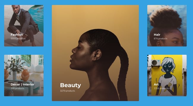
By dividing different types of content into cards, users can choose which articles they want to explore further.
This helps keep the homepage clean and organized without relying on too much text.
.
لماذا هو مفيد؟
Card-based design has become more common across B2B and B2C websites because it helps present information in easy-to-digest chunks
for users. Using this design on your website can help showcase multiple products or solutions side by side.
Keep in mind that your cards should be responsive. This means that as the screen size gets smaller or larger,
the number and size of the cards displayed should adjust accordingly.
.
Featured videos
In addition to background videos, short product or feature videos are also trending
as they can be used to highlight a specific use case. These short videos are great for bringing a solution to life
Yours without overwhelming visitors with a lengthy experience they have to sit through.
.
لماذا هو مفيد؟
B2B companies benefit from videos that explain their products and help positively influence the decision-making process.
لدى المشتري.
.
Responsive design
First-generation websites were designed for desktop computers. As a result, they were built to fit larger screens
and mouse-based point-and-click navigation. However, the rise of mobile devices means web traffic can come from
متعددة – ويجب أن يقدم موقع الويب الخاص بك نفس التجربة بغض النظر عن نوع جهاز المستخدم.
In practice, this means creating mobile-friendly website layouts that take advantage of responsive web design
responsive, allowing website elements such as images, text, and user interfaces (UIs) to resize and adapt
automatically based on the device used to access the site.
.
لماذا هو مفيد؟
Mobile devices now account for more than 54 percent of all web traffic worldwide.
This means that if your website isn’t mobile-friendly, you could lose up to half of all potential customers.
Consider a desktop-friendly website accessed by a smartphone user. If the text and images aren’t resized
and the buttons aren’t adapted to touch controls and a smaller screen, it’s almost impossible for
العملاء المحتملين العثور على ما يبحثون عنه – بعد عدة أخطاء خاطئة من المحتمل أن يأخذوا نشاطهم التجاري إلى
مكان آخر.
.
الفضاء الأبيض
White space is often used in minimalist web design, but it is now an important feature of modern website frameworks.
By balancing content such as links, text, and videos with similar amounts of white space, you draw
users naturally to the key aspects of your website. While there’s no hard-and-fast standard for how much white
space you need, a good rule of thumb is to leave some white space between every element
عناصر المحتوى.
.
لماذا هو مفيد؟
Site navigation plays an important role in user satisfaction. If visitors have trouble finding your product or contact pages
of your own, they’re unlikely to click and start the conversion process.
White space helps direct users’ attention to the elements that matter most to your business. For example, if you have a
featured product image or video at the top of your homepage, separate it from the surrounding content with white space. This
helps it stand out on its own and highlights its importance compared with the rest of your site. However, if it’s surrounded by visually
noisy elements, the focus will quickly be lost.
.
تحسين السرعة
Having an attractive, content-rich website won’t help increase conversions if your site loads slowly and
Users are taking their browsers elsewhere. As a result, it’s essential to optimize every element of your website for speed
to reduce the time between a click and the content appearing.
In practice, this means optimizing all images to balance image quality and file size.
For example, while PNG images offer higher quality and transparency, they’re much larger than JPEGs. In most cases,
JPEGs offer the best balance of speed and quality. Meanwhile, GIFs are ideal for animations,
but they use fewer colors, making them less than ideal for still images.
من الجيد أيضًا ضغط أي ملفات مستضافة على موقعك – يمكن للعديد من أدوات الضغط الحديثة تقليل حجم الملف
significantly without a proportional loss of functionality. Website owners should also consider their hosting environment:
for example, dedicated hosting or a VPS will typically deliver faster website load times than shared hosting solutions.
.
لماذا هو مفيد؟
According to Google statistics, as page load times increase from one second to 10 seconds, the visitor bounce rate rises by
123 بالمائة. يلاحظ عملاق البحث أيضًا أنه على الرغم من التحول إلى اتصالات 4G أكثر قوة “لا تزال غالبية مواقع الهاتف
المحمول بطيئة وممتلئة بالعديد من العناصر”.
As a result, even small investments in improving website speed can deliver significant returns, especially since page speed
is now used by Google as a ranking factor for mobile searches and Google Ads.