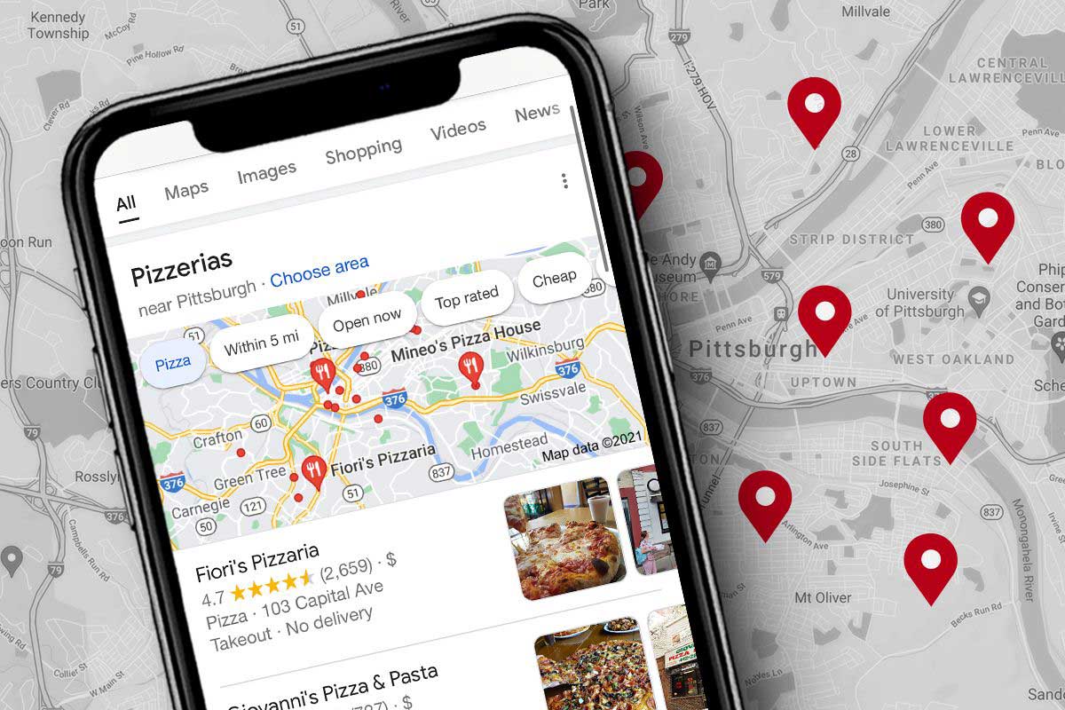
Improve Your Google Maps Ranking | 4 Effective Steps
31 January، 2022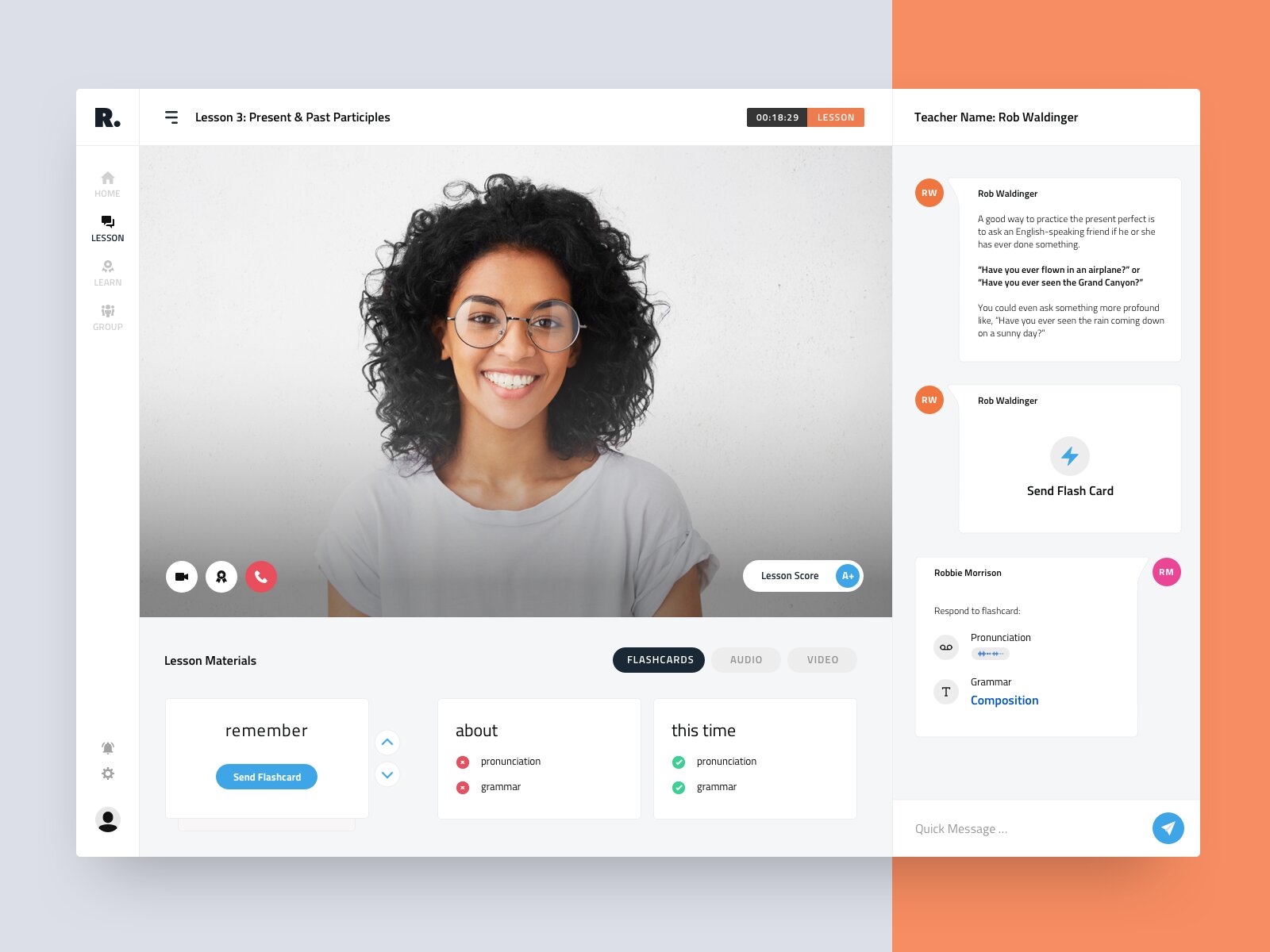
Building an E-Learning Website | Key Types and How to Make It Ideal
2 February، 2022
Mobile-Friendly Website Design | 8 Proven Tips
Mobile website design is essential. Why? Because mobile devices are revolutionizing the way we connect, In fact, the majority of
web traffic now comes from mobile devices.
In this section, we’ll take a closer look at eight mobile website design tips you can use.
In addition, you’ll see real-world examples from some of the best mobile websites on the web.
Use large buttons
تحتاج Mobile-friendly websites to having buttons large enough for users to tap without needing to
إلى التكبير.
Additionally, there should be space between hyperlinks. If links are placed too close together
close together, users may try to tap one link and accidentally tap another.
تستخدم Shopify Use large buttons and leave plenty of space between hyperlinks in your mobile website design.
So, when designing a responsive mobile website, consider spacing and make sure users can easily tap
each hyperlink.
You may also be interested in: 6 Key Reasons Visitors May Hate Your Website and Never Return
Make text large enough to read
This may seem obvious, but it’s also important for mobile-friendly web design.
يجب ألا يضطر المستخدمون إلى التكبير مطلقًا – أو التمرير يسارًا أو يمينًا – لقراءة شيء ما. يجب أن يكون النص
Always large enough to read comfortably.
In the example below from Beardbrand, you can see that all the text fits perfectly on the screen.
Make text large enough on screens of every size so users can easily read what you want to say.
تبسيط القوائم
Desktop site menus have plenty of space. They can fill an entire bar at the top of the screen,
and offer comprehensive dropdown options—all without getting in the way of the user experience.
هذا ليس هو الحال على الأجهزة المحمولة – لا توجد مساحة كافية.
Mobile-friendly websites should use simple menus that provide an overview of the site.
Users can then use categories, filters, or search to narrow down what they’re looking for.
-تستخدم معظم مواقع الويب المتوافقة مع الجوّال رمز الهامبرغر – الذي يتكون من سطرين أو ثلاثة خطوط أفقية
للإشارة إلى قائمة.
-عند Create a mobile-responsive websiteKeep your menus simple so users can easily find what they’re looking for.
You may also be interested in: Top tips for maximizing conversions on your contact page
Provide a simple, intuitive search feature
Your website’s search feature is especially important for mobile users.
As mentioned above, simplified menus can make mobile browsing easier. However, they can also زيادة
make it difficult for users to find a specific item.
To help users find what they want, put the search feature front and center.
Make a simple, effective search feature part of your mobile website design.
Make it easy to contact you
إذا كان العميل يبحث عن تفاصيل الاتصال الخاصة بك، فمن المحتمل أن يكون قد واجه مشكلة – مما يعني أنه
probably already feeling somewhat frustrated. Don’t make things worse by making it difficult to get in touch.
Especially when 84 percent of consumers consider customer service a key factor in their purchasing decisions.
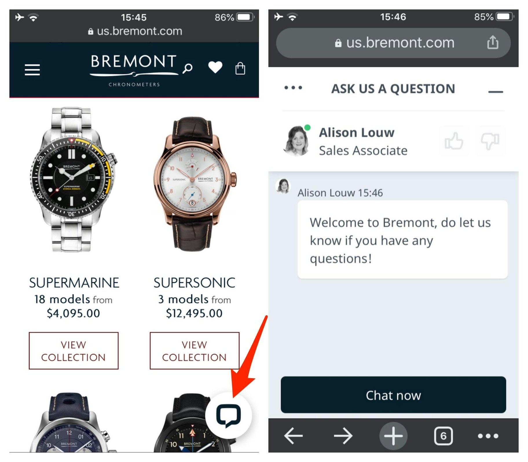
Here’s another great example of mobile website design from Bremont. The luxury watch brand
This chat icon in the bottom-right corner of the screen makes it quick and easy for website visitors to contact a representative.
If you can’t offer live chat around the clock, consider linking to the Facebook chatbot,
أو قم ببساطة بتوفير نموذج اتصال يمكن للمستخدمين الوصول إليه عبر رابط “جهة اتصال” في قائمتك.
You may also be interested in: 5 Reasons Why Launching Your Website Is a Project That Never Ends
Create simple forms
Users may be more willing to fill out a long form on a computer, where the screen is larger and typing is easier
with a keyboard.
On mobile devices, forms should be shorter, with large text fields and buttons.
For example, if you ask users to sign up for your mailing list, you shouldn’t ask for more than
First name and email address.
If you need to include more questions, make them quick and easy to answer.
In short, keep your forms short and sweet.
Create eye-catching calls to action
عبارة الحث على اتخاذ إجراء – المعروفة أيضًا باسم CTA – هي صورة أو شعار أو جزء من النص الذي يدعو
users to take a specific action.
For example, you might ask users to sign up for your email list or learn more about an offer.
أو شراء منتج. This marketing approach plays a key role in mobile website design.
However, it can be difficult to create compelling calls to action with such limited screen space to work with.
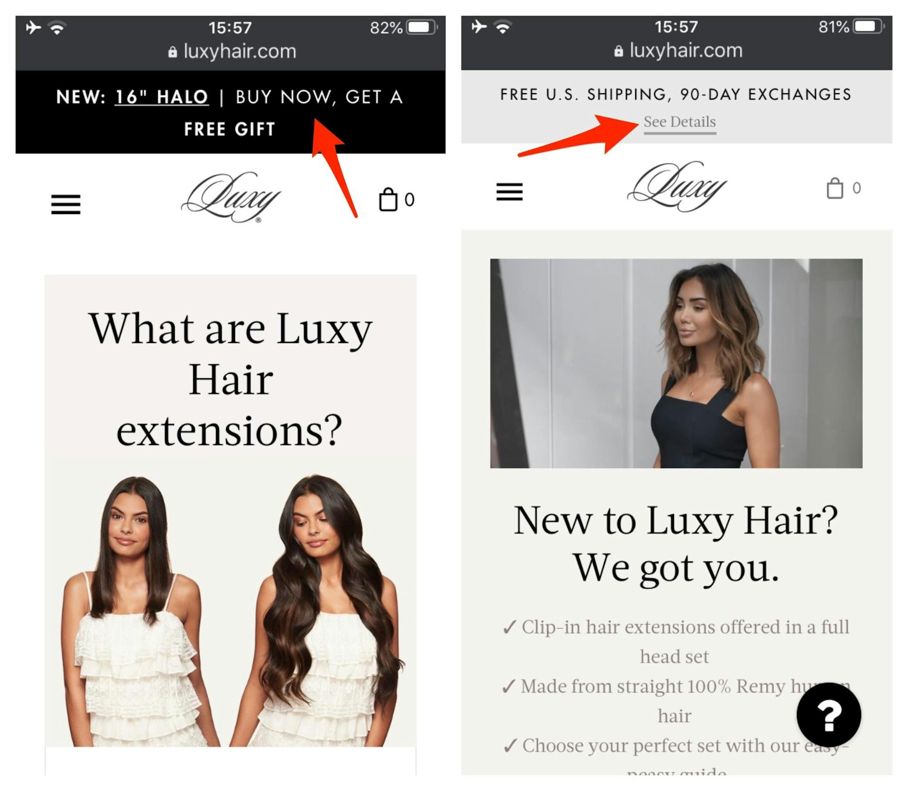
In this mobile website example from Shopify user Luxy Hair, you can see two ads featuring calls to action
that prompt users to take action. The first promotes a new product that comes with a free gift, while the second encourages users
to learn more about the brand’s free shipping and 90-day exchange policies.
Create eye-catching calls to action
When creating calls to action for your mobile-friendly website, make them stand out by
placing them above the fold, where users can see them without having to scroll down.
You may also be interested in: 4 Tips to Give Your Business a Competitive Edge
Avoid pop-ups
Let’s face it: most people hate pop-ups. In fact, if you Google the phrase
“أنا أكره الإعلانات المنبثقة”، فستجد ما يقرب من 48 مليون نتيجة
It’s no surprise that Google introduced an algorithm update in 2017 to penalize websites that use certain types of
mobile pop-ups.
These days, your search rankings may be affected if you:
- Display a pop-up that covers the main content
- Display a standalone interstitial that users must dismiss before they can access the main content.
- Make the top of the page look like a standalone interstitial and place the original content below it.
However, some types of pop-ups should not negatively affect your rankings, such as:
- Interstitials used to meet legal obligations, such as age verification or consent for cookies,
linking, or the General Data Protection Regulation (GDPR).
- Login windows for accessing private content, such as email or content protected by a paywall
or subscription.
-الشعارات الصغيرة التي يمكن تجاهلها بسهولة و “تستخدم قدرًا معقولاً من مساحة الشاشة”، مثل لافتات
Install the app used by Chrome and Safari.
Summary: Mobile Website Design in 2022
A mobile-friendly website is designed to work well on smartphones and tablets.
Now that the world is mobile-first, your website should be too.
In short, here are eight tips for designing mobile websites:
- Make buttons large enough for people to tap.
- Make sure the text is large enough to read without users having to zoom in.
Simplify your menu to make it easier to navigate on a small screen.
Put search front and center, and let users filter their results.
Make it easy for users to contact you.
Create simple, easy-to-use forms.
Place prominent calls to action above the fold.
Avoid frustrating users with pop-ups unless they’re absolutely necessary.
What are your thoughts on mobile website design? Have we missed any great mobile web design best practices?
Let us know in the comments below!