Mobile App Marketing Strategies to Boost User Retention
2 October، 2022
6 Reasons to Redesign Your Website
10 October، 2022
تصميم تذييلات موقع الويب Footer – أفضل الممارسات مع 5 أمثلة
Website footers are essential UI patterns. They guide visitors to important content while providing an opportunity
to add business value and connect with new customers.
This article explores website footer design, dos and don’ts, expert examples, and best practices.
To inspire your next web project.
.
What is a website footer?
A website footer is a user interface element at the bottom of a website or app. Footers
are important website components because they display useful information, including navigation links, contact details,
policies, copyright information, and social media links, so users can learn more about your business.
The primary navigation links; a website footer appears on every page so users can
always access links and content. Although it appears at the bottom of a web page,
Footers are vital components for users and business goals.
.
Read also:13 Proven Tips to Improve Your Website
.
What is the purpose of a footer?
How designers use a website footer depends on the business and its content. Most websites use
التذييل للتنقل الثانوي – روابط مهمة لا يمكن احتواؤها في رأس موقع الويب مثل حول، ومستندات المنتج، والموارد،
وما إلى ذلك.
as well as legal information related to the General Data Protection Regulation (GDPR), the California Consumer Privacy Act (CCPA), and other requirements.
يwebsites must include certain policies, such as privacy policies and terms of use. Designers usually
place these links in the footer so users always know where to find them.
.
فوائد المبيعات
Many UI/UX designers also use website footers for commercial purposes, such as product CTAs or capturing leads
through a contact page or newsletter signup form. Footers help users navigate to
feature pages, best-selling product categories, or more information about services.
.
Read also:What’s the Simple Way to Design an Elegant Website?
.
فوائد التسويق
Many marketers also use website footers for search engine optimization (SEO). There are two
SEO benefits of footers:
- They help boost the pages you want to rank
- Homepage links carry weight, meaning search engines consider these internal links important and give them priority
وفقًا لذلك
- Increases the likelihood of clicks, helping reduce bounce rates and improve domain authority and rankings
.
What should a footer include?
Again, this depends on the website. An e-commerce site will have different priorities for its blog footer. Below is
a list of elements you might include in the footer:
-روابط التنقل
- Brand and messaging
-الشهادات – التوصيات
-حقوق النشر
.
Read also:6 Web Design Tips to Grow Your Business and Increase Conversion Rates
.
-روابط التنقل
Companies include several types of navigation links in their footers. These include:
- Utility links: contact information, phone number, email address, physical address, and contacts
- Customer service, privacy policy, and terms of use
- Navigation: a copy of the main navigation for convenience (may be unnecessary for sticky headers)
- Secondary task links: job applications, investor information, documentation/specifications, press information, and subscriptions
affiliates, FAQs
Sitemap: links to multiple topic and product categories
.
Branding and messaging
الاستخدام الشائع الآخر لتذييل موقع الويب Footer هو مشاركة العلامة التجارية والرسائل – الروابط ومحتوى التذييل
that encourage people to connect with the company, including:
Social media icons
-اشتراكات البريد الإلكتروني
.
Read also:How to Keep Visitors from Leaving Your Website’s Landing Page
.
الشهادات – التوصيات
Some brands use the footer for testimonials and reviews. They may also include a Google Business widget.
Or Trustpilot, which displays its star rating. These UI patterns are great for social proof and generating interest
in your product or service.
.
Copyright
The copyright symbol and notice at the bottom of the footer tell visitors that you own the website’s content. It’s not
a legal requirement, but it’s common practice to let people know that you intend to protect your rights to the content.
.
Read also:6 Essential Elements of a Successful Website
.
.
5 Footer Design Examples
We’ve selected six footer design examples from different industries to show how designers create layouts that align with
business goals and user needs.
The main takeaway from these examples is how different industries prioritize links and content. Each example also
uses a simple, clean layout to help visitors find information quickly.
بي بي سي – تصميم تذييل الأخبار
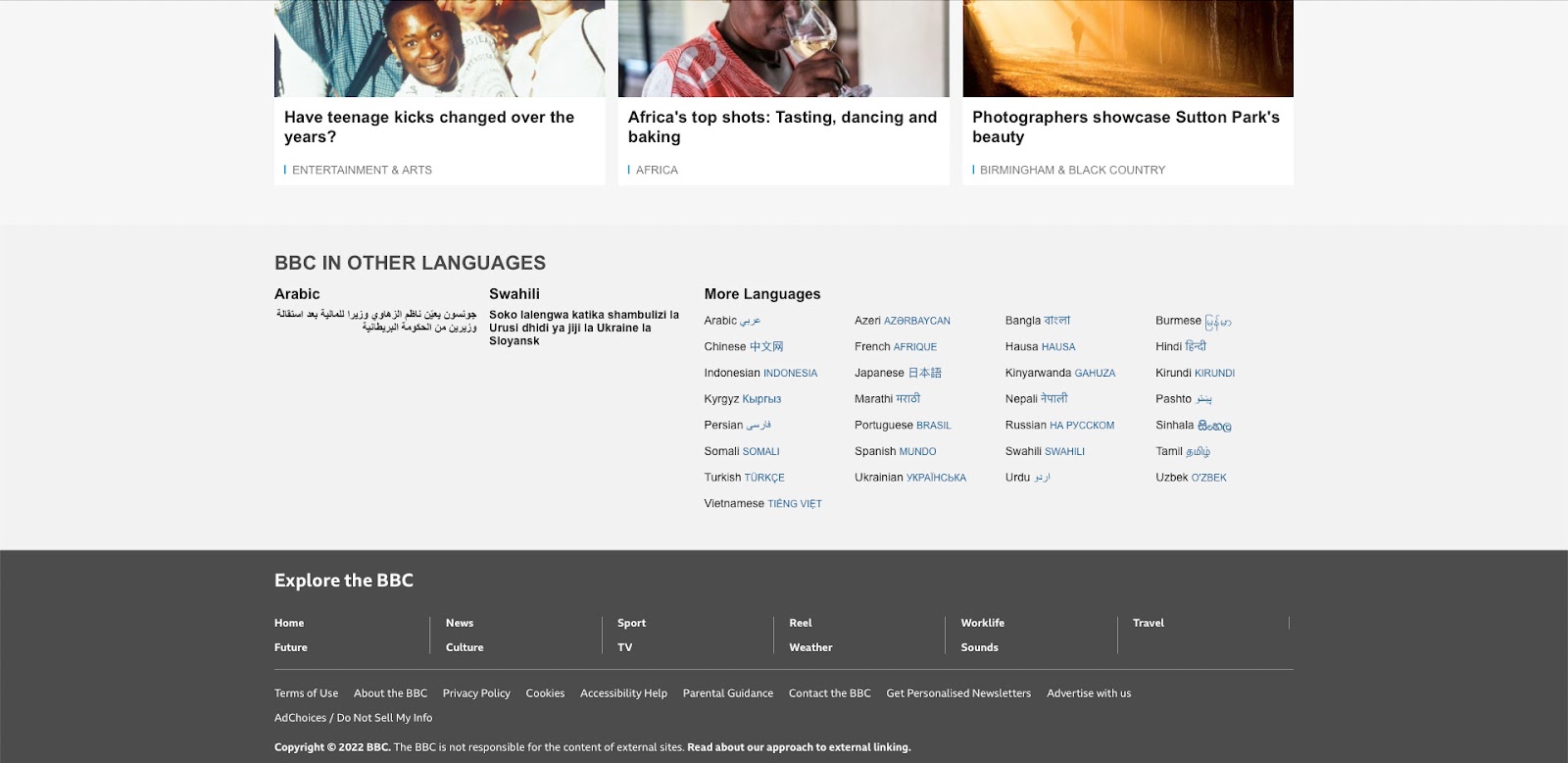
The British Broadcasting Corporation (BBC) is one of the largest news and media organizations in the world.
The media giant mainly uses its footer to showcase versions of its website in more than 30 languages, along with a separate section
for popular news topics. The bottom of the page contains links to legal information, policies, and contact details.
and ads with the BBC.
The clean design is easy to read, helping users find content and links quickly.
.
Asos – تصميم تذييل التجارة الإلكترونية
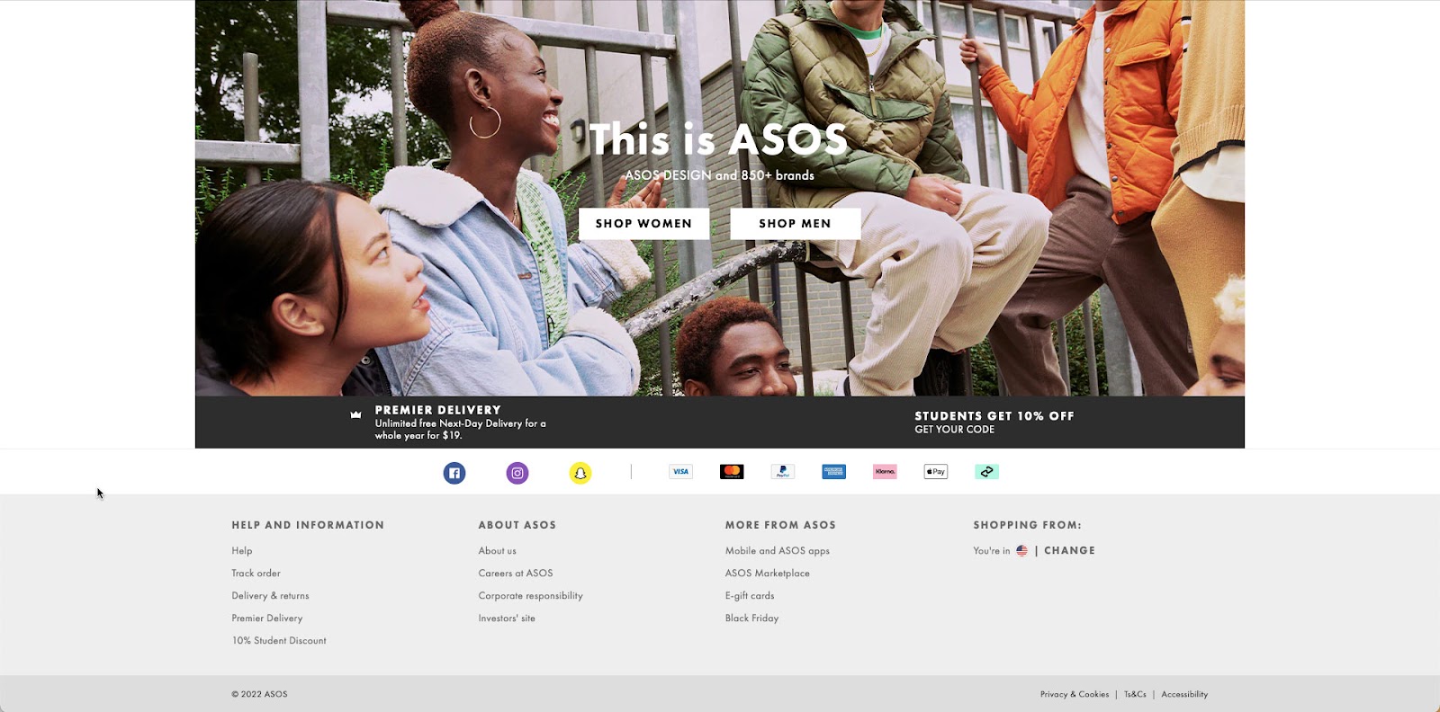
Asos
The global e-commerce brand uses Asos a simple footer design with social media buttons
payment methods, and useful links. Most important for e-commerce are links to delivery and returns policies,
وتتبع الطلبات، والعروض الترويجية الخاصة – في حالة Asos، يقومون بالترويج لخصومات الطلاب وبطاقات الهدايا
and Black Friday.
As a publicly listed company (ASOMY), Asos must provide information for investors and on corporate responsibility.
Finally, as a global e-commerce brand, Asos shows customers which store they’re viewing and provides a link to switch to
another region and currency.
.
Read also:How to Get More Followers on Your Website: 10 Tips
.
.
تصميم زورو – تصميم تذييل الوكالة
تصميم زورو
Agencies generally use their websites for two purposes:
-اعرض عملهم
- Generate new leads
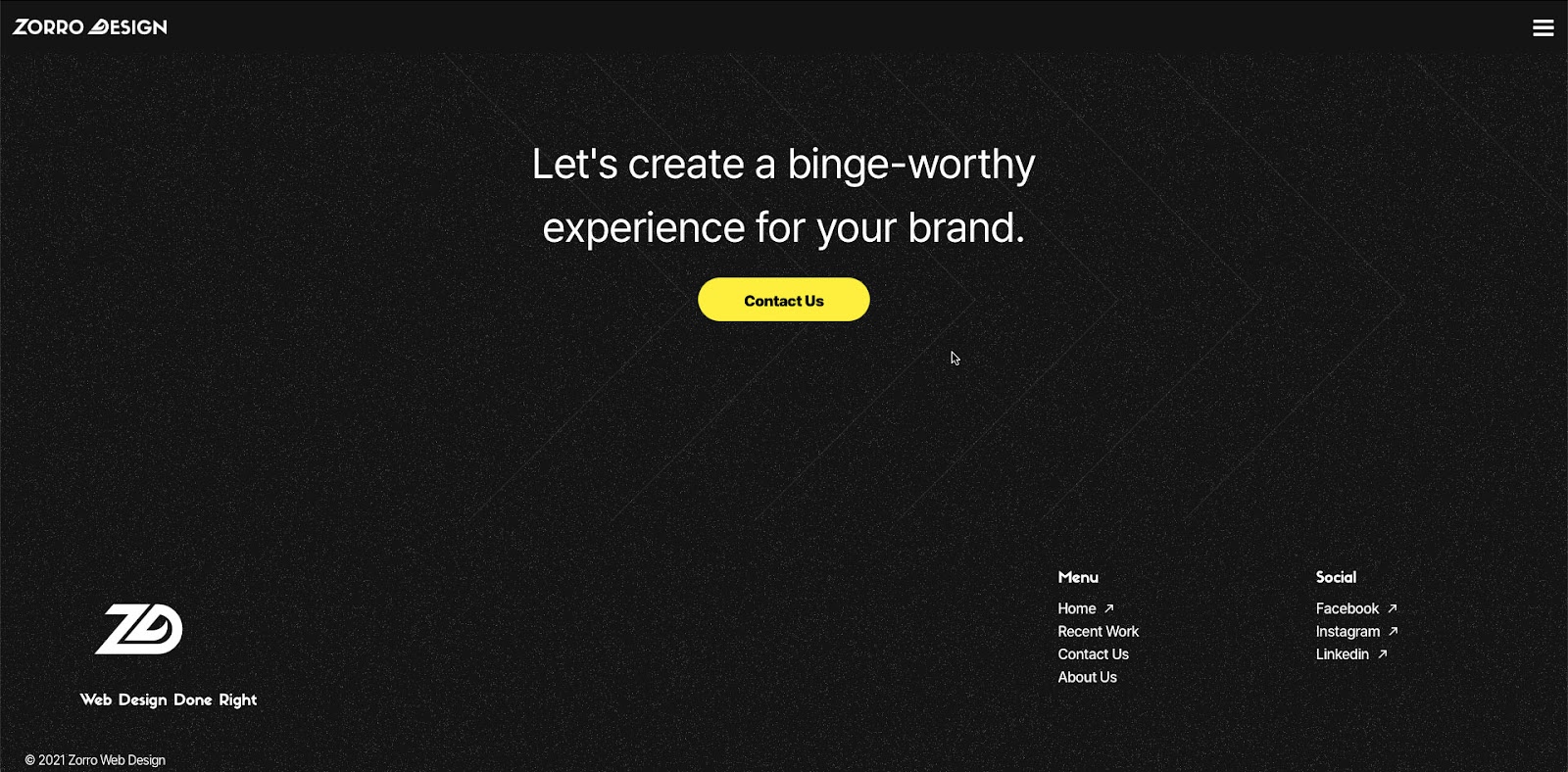
US-based Zorro Design uses a black-and-white footer design with a bright yellow CTA that takes
users to a contact form. Zorro’s designers laid out the footer perfectly, placing the CTA in the center of
الشاشة، مع وجود الكثير من المسافات البيضاء المحيطة التي تصرخ “CLICK ME!”
Finally, Zorro places its logo and tagline on the left alongside several key links, including Recent Work,
Contact, About, and social media buttons.
Zorro’s footer design is clean and organized, making it easy for users to take in the content and find what they need quickly.
.
أليكس لاكاس – تصميم تذييل عمل لحسابهم الخاص
أليكس لاكاس
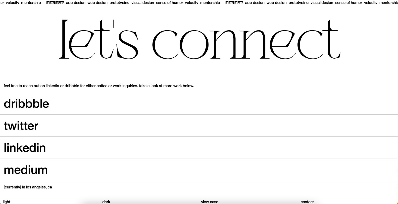
Like agencies, freelancers need a portfolio website to showcase their work and attract clients. Product
designer Alex Lakas uses his website footer mainly to connect with clients/employers
and fellow designers through his social channels.
بصفته عاملًا عن بُعد، يستخدم Alex أيضًا نصًا وامضًا لإخبار الزائرين بمكان عمله حاليًا – وفي هذه الحالة،
Los Angeles.
Alex’s dark/light mode toggle is a nice touch for a UX design portfolio, showing that he cares about accessibility.
Access to the web. It also includes links to previous work and a contact page.
.
Booking.com – تصميم تذييل السفر
Booking.com
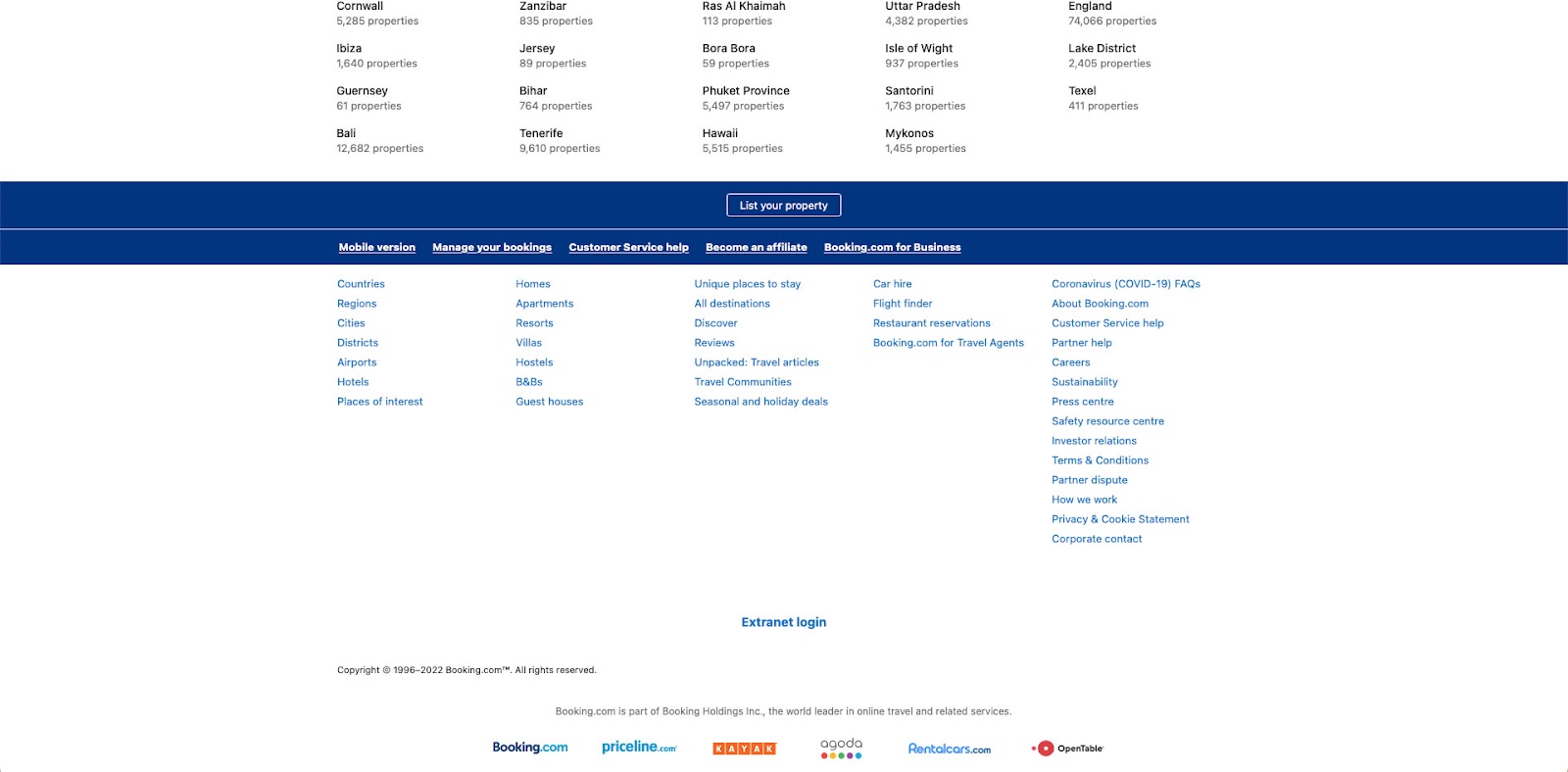
Booking.com is one of the world’s largest online travel agencies, with more than 28 million properties in
more than 70 countries. Booking.com’s goal is to sell accommodations, but it also wants to add new properties, so
فإن التذييل الأساسي للحث على اتخاذ إجراء هو “إدراج ملكية”.
The website footer also highlights its five most important links with large, bold typography. Customers can also browse
a variety of search categories, including regions and accommodation options, to find their ideal destination faster.
As a publicly traded company (NASDAQ: BKNG), Booking.com includes links to all investor information
and company information.
At the bottom of the page, Booking.com displays several logos for the company’s holding group,
Booking Holdings Inc.
.
Read also:How to Design Outstanding Online Courses in 5 Steps
.
How to Design a Footer
Prioritize Links
The first step in designing a great footer is prioritizing your links. Designers should consider user needs
and business goals to create something useful and helpful for visitors.
.
Less Is More
Crowded user interfaces consistently perform poorly. They’re hard to take in and can confuse users. They can
Reducing UI elements, links, and text can help direct traffic to your most important content
– مما يعيدنا إلى النقطة الأولى، وتحديد أولويات الروابط الخاصة بك بشكل صحيح!
.
Use a Single CTA
A single CTA helps guide visitors toward the most important task or business goal. Footer designs are usually two-toned,
often in black and white, providing the perfect backdrop for a brightly colored call to action that stands out
انتباه الناس.
.
Make Footers Mobile-Friendly
A mobile-first approach is essential for website footers. On desktop, you might have 3–4 columns,
while on a smartphone, you have one. The more columns and links there are, the farther users have to scroll to find the content.
Place the most important links and content in the first column so users see them first.
.
Use Hierarchy to Convey Importance
Examples from Booking.com, Zorro Design, the BBC, and Alex Lakas use visual hierarchy to highlight
the links that matter most to users. Different sizes, colors, and font weights are effective ways to convey importance.
.
ابق ملتزمًا
Legal information, such as policies and disclaimers, is essential to modern web design. Designers should
research their companies’ obligations regarding where and how these links must be displayed.
For example, in some countries, financial and investment products must display disclaimer information in
The footer, so it’s always visible to customers. See this example from Chase Bank.
.
Branding Opportunities
Your website footer is a great opportunity to connect users with your brand’s touchpoints,
such as social media, newsletter sign-ups, and company links.
.
كن مفيدًا
Users often scroll to the website footer looking for help, such as documentation and tutorials,
as well as the blog and other resources.
.
Read also:Mobile App Marketing Strategies to Boost User Retention
.